
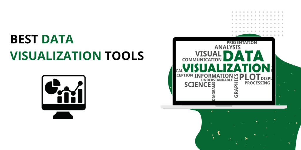
Data visualization tools are essential because they turn data into insights. By visualizing data, we can see patterns and relationships that we would not be able to see by looking at raw data. Data visualization tools also make it easier to communicate data to others. When data is presented visually, it is easier for people to understand and remember.
Deep Dive into Best Remote Desktop Software and Access Tools
They can help people spot trends and outliers, find relationships between variables, and identify cause-and-effect relationships. They can also help people communicate their findings to others clearly and concisely.
Zoho Analytics

It is a data visualization tool that makes it easy to see relationships in your data and understand complex concepts. With this, you can quickly create visualizations that help you see trends, spot outliers, and find patterns. You can also use it to share your findings with others to understand your data better.
This Tool provides a wide range of analyses and charts to help users understand their data better. It also offers access to all your key metrics so you can quickly drill down into any report.
Companies use this Tool when they need to present company-wide analytics, trends, or KPIs at a glance to all stakeholders within their organization.
Databox
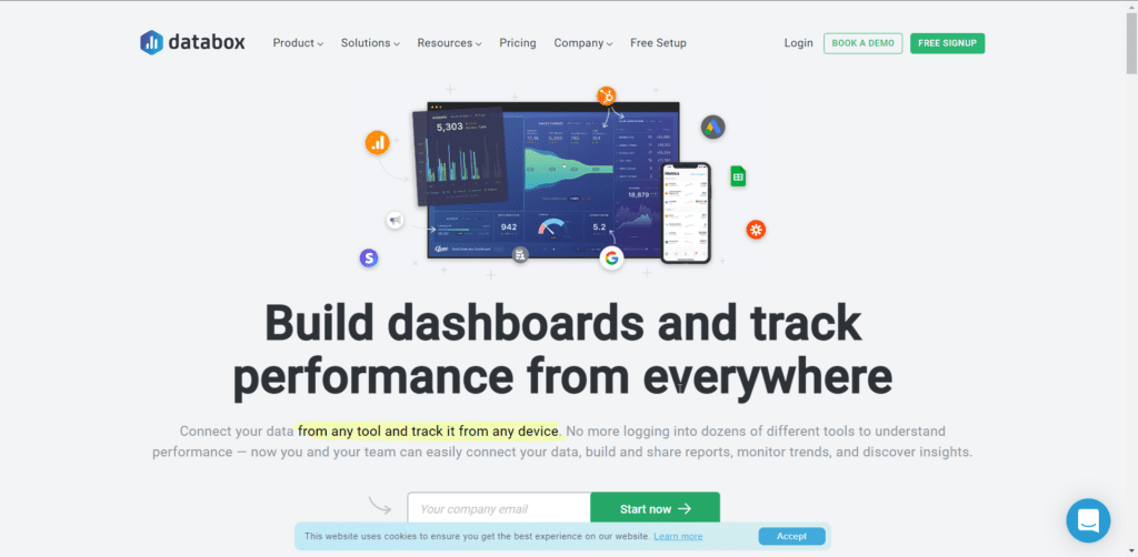
It is a powerful business analytics tool that helps organizations make better decisions. It also provides a single, centralized place for all your data, making it easy to track performance and identify trends. With this, you can:
- Access data from multiple sources in one place
- Visualize data to identify patterns and trends
- Share data with team members to collaborate on decision-making
- Export data for further analysis
It is the ideal tool for organizations of all sizes that want to use their data better. Get started today to improve your decision-making process!
The new version (Databox 2) includes some exceptionally cool features, like the graph gallery, real-time updates, and alerts for notifications about upcoming deadlines. However, the best quality of this version is the ability to use third-party charts like D3.js and Highcharts – this saves a lot of time with visualizing all the data from scratch and gives you more creative control over your graphics.
Tableau
This data visualization tool allows users to quickly and easily create visuals from their data. It is also a powerful tool that can be used to create complex and beautiful visuals from data. This is an excellent tool for exploring and understanding data.
Visualization helps make connections between data more obvious, facilitating a more intuitive understanding of the information in the context of its underlying meaning.
The Tableau Data Visualization tool is one of the best-selling data visualization tools on the market, with over 60% market share.
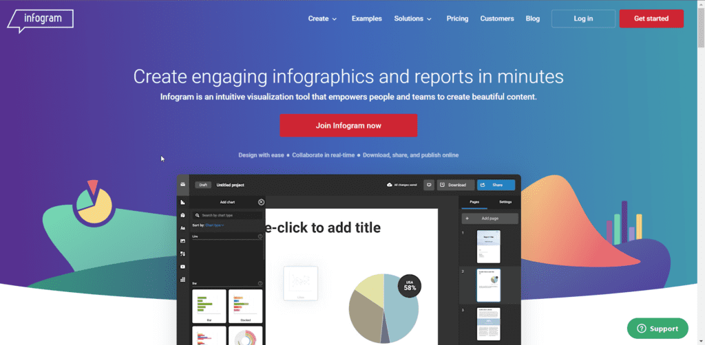
Infogram
Data visualization is the process of representing data in a graphical format. It can be used to communicate data more effectively or to find patterns and relationships in data.
This free online data visualization tool makes it easy to create beautiful charts, graphs, and maps. You can upload your data or use one of their many built-in datasets. You can also customize the look and feel of your infographic, to match your brand or website.
It is a great way to communicate complex data in a visually appealing way. Whether you’re sharing data with colleagues, customers, or the general public, creating infographics that will engage and inform your audience is easy.
ChartBlocks
It is a data visualization tool that makes it easy to create, share and embed interactive charts and graphs. With this, you can quickly turn your data into beautiful charts and graphs without coding or hiring a designer.
This is the perfect tool for non-designers who want to create beautiful data visualizations. Plus, Sharing your visualizations with others or embedding them on your website or blog makes it easy.
This is user-friendly and provides tutorials on its website to help those who are not too familiar with graphical representations of data.
Datawrapper
It is also a data visualization tool that allows users to create stunning visualizations of their data. The Tool is easy to use and provides various options for customizing the visualizations.
It’s an excellent tool for creating beautiful visualizations of your data. It is easy to use, with various options for customizing the look of your visualizations. You can use this to create bar charts, line graphs, pie charts, and more.
There are many use cases of it when it comes to data visualization. One of them is to help journalists communicate complex data in a digestible way to audiences or other journalists. Another one is for marketers trying to find new ways of presenting their campaigns or messages in the most appealing way possible with interactive charts and graphs.
Plotly Data Visualization

It is sophisticated software that makes it easy for anyone with a basic understanding of technology and data to visualize their information in graphs and charts. Not only does it make the process extremely simple, but it also gives you more insight into your data than ever before possible.
- This Tool allows users to create interactive, custom data visualizations.
- It is easy to use and offers a wide range of features, making it an excellent choice for data visualization.
- With this, you can create beautiful, interactive data visualizations that are easy to share and embed in your website or blog.
Ember Charts
It is a powerful data visualization tool that lets you see your data in a new way. With this, you can easily create beautiful charts and graphs that help you better understand your data.
This is easy to use and quick to get started with. You can create charts and graphs in minutes, making it easy to share your data with others.
It is a great way to visualize your data and a tool that everyone should try out.
The strength of It lies in its ability to be customized and developers being able to add their logic and essentially create their own “chart types.”
It’s easy to use, intuitive, and supports all the popular frameworks (e.g., React.js, Angular, Vue.js). The charts generated by It are flexible and responsive, which makes them perfect for displaying on any screen size or resolution without losing their quality or compromising the responsiveness of your app or website.